10 Basic Elements of Garden Design
Understanding and employing the basics elements of garden design will transform your garden from a collection of plants into one beautifully crafted, cohesive space. We’ll review ten principles that are critical to successful landscape design, and you’ll learn what key terms like texture, contrast and viewpoint mean as they relate to garden elements.
Designing a garden is a process that takes some refining over time to get just right. Understanding and employing the basic garden design elements can transform your garden from a collection of plants into one beautifully crafted, cohesive space. Let's review ten key principles that are critical to successful landscape design principles. Read on to learn what terms like texture, contrast and viewpoint mean as they relate to garden elements. Then, bookmark this page to come back to whenever you need a refresher course.
Here we go! Let's start with everyone's favorite...
COLOR

Photo courtesy of Canva.com
The first element that often comes to mind when designing a garden using garden design ideas is color. Color comes into play when you’re choosing flowers and foliage plants, planters, sun umbrellas, patio furniture cushions and more for the garden as part of effective landscape design. Just like you decided on a color palette for your home interior, you can do the same for the outdoors. You might start by picking one must-have color plus one or two more to coordinate with it, or you might need to start with the color of an unchangeable element such as the color of your home’s siding in landscape design principles.
Warm Color Palette

Warm Colors: Red, orange, gold, pure yellow, pink, fuchsia, red-based purple
Mood: Warm colors create a feeling of excitement and welcoming energy in a space. They make objects feel closer and may promote a healthy appetite.
Uses: Front entrances, porch pots and baskets, making a large seating area feeling cozier, outdoor dining scene
Cool Color Palette
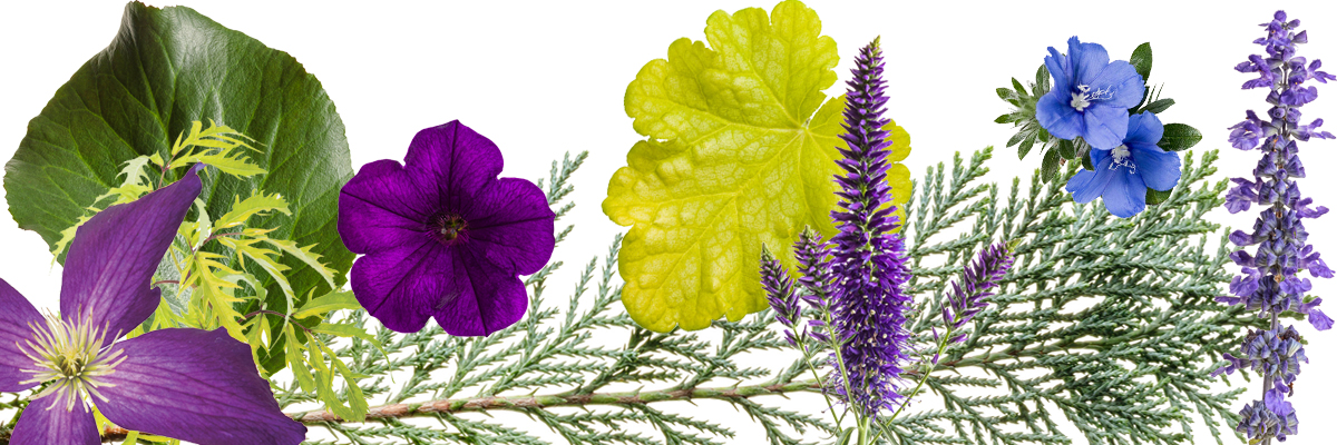
Cool Colors: Blue, blue-based purple, green, chartreuse, green-based yellow
Mood: Cool colors create a feeling of calm, relaxation, and a Zen-like mood. They can make objects appear further away and make small spaces feel more spacious.
Uses: Quiet reading nook, next to a garden bench, hammock, anyplace you go outdoors to relax and regain a feeling of calmness.
Neutral Color Palette

Neutral Colors: White, black or near-black, silver, tan
Mood: A resting place for the eye amongst a sea of color (even green), creating more of a calm mood than energetic.
Uses: Separating other colors to bring about order in a multi-colored space, creating a modern vibe and a backdrop from which other colors will shine.
TEXTURE
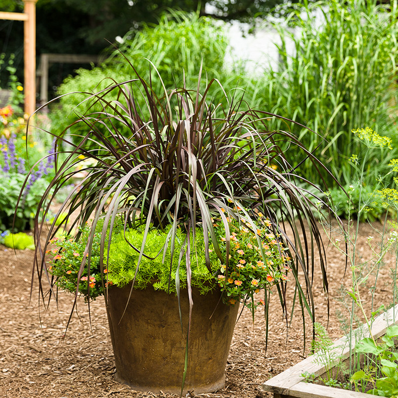
Texture describes both how an object feels and looks in garden design basics. For instance, you can see that an ornamental grass has fluffy seed heads and you expect them to feel soft to the touch, too. Every object in your garden has a texture, whether it is a plant, paving stone, structure or container within intentional landscape design.
A well-designed garden includes a mix of textures. When too many of the same textures are placed together, the space can feel dull or disorganized, which weakens garden design ideas. Your eye doesn’t know what to focus on. But when you add in a totally different texture to the mix, it can instantly transform the composition.
Fine Texture
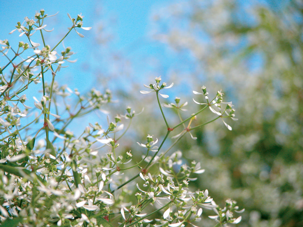
Plants with fine texture have little leaves, small sprays of flowers, or an airy habit as part of the basic elements of garden design. They pair well with plants that have bold texture to make those stronger elements feel more grounded in the space and less overbearing. Objects with fine texture have smooth sides like a sleek glazed container or a stucco wall.
Medium Texture
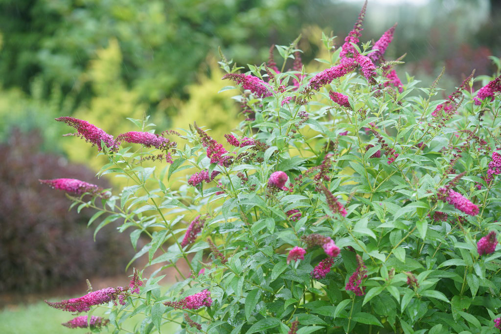
Plants with medium texture have mid-sized leaves and/or flowers, a habit that’s not too airy but also not dense and blocky. You can see spaces between the stems of a medium textured plant; they are just big enough to let light in and allow finely textured plants weave their way through using sound landscape design principles. Most of the plants in any given garden design have a medium texture. Objects that have a medium texture include things like brickwork and fabric with a medium-sized graphic pattern.
Bold Texture

Plants with bold texture have large leaves and/or flowers with gaps in between. They are usually the plants your eye gravitates towards first because they are prominent features of the design, reinforcing strong garden design ideas. They stand out among a sea of fine and medium textured plants. Objects that have a bold texture include chunky elements like fieldstone, brightly painted Mexican pottery and sun umbrellas with a large pattern.
SHAPE/FORM
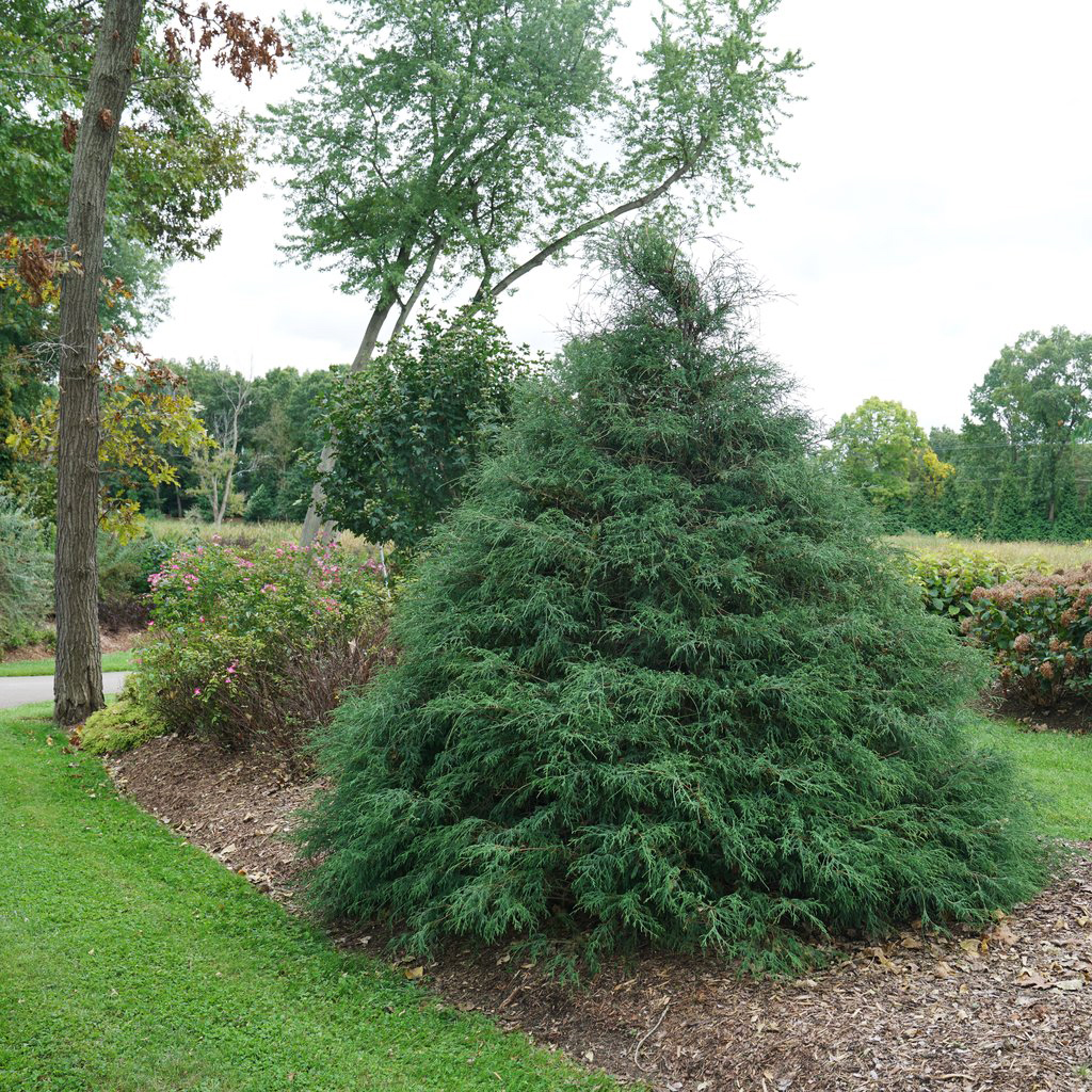
In garden design, the concept of shape or form applies to the overall look of a plant, the form of its flowers and leaves, the way a garden bed is laid out, garden art objects and more as part of the basic elements of garden design. Some shapes are tall and pointy while others are short and rounded. An object’s shape is especially important to consider when thinking about contrast and focal points, which we’ll cover below.
When you are planning a new garden bed, consider shape and form before you decide which specific varieties of plants to use. For instance, you may want something taller and pyramidal in the center of the bed surrounded by something low and mounding around the edge. Visualize the shapes of the plants you want first, then go out and find the plants that fit that vision using established landscape design principles.
CONTRAST
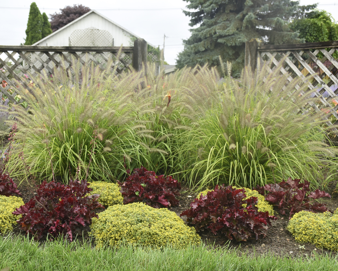
Don’t skip this one! Contrast is the key to making the first three garden design elements we’ve discussed work. Without it, you’ll find your landscape design is lacking. If you just aren’t satisfied with the way a part of your garden looks, check for contrast—it’s often the missing element. Contrast takes a collection of random colors, textures and shapes and showcases their unique differences.
When you bring a new plant home and are deciding where to plant it, consider contrast. What color would your new plant contrast well with? Which plant has the opposite type of leaf or flower shape that would contrast with your new one? If your new plant has little leaves, find a plant with large leaves or a dense, blocky form to plant it next to.
When choosing your color palette, you’ll find the most eye-catching pairings are those of contrasting colors. See the color wheel of warm and cool colors above? Colors that are across from each other on the spectrum are contrasting—for example, purple and yellow. Contrasting colors are always a good match, whether you are pairing a pot of flowers with your patio cushions or two plants in a single container.
VIEWPOINT

Designing from the primary viewpoint affects your overall satisfaction with the landscape design. Think about the vantage point from which you typically view the part of your garden you are designing. Are you working on a bed that you see out your kitchen window every morning? Or from your patio in the evening?
Stand in the place where you will view that part of your garden most often and visualize what you’d like to see there as part of garden design ideas. Perhaps it will lead to adding a birdbath as a focal point out a window you often look. It might mean planting a lilac bush next to your bedroom window where you can see its blooms up close and their heady fragrance will fill your room. Designing from the primary viewpoint ensures you will be able to fully enjoy the fruits of your labor.
LINE

In garden design, lines are used to lead the eye to where you want the viewer to look or go, following proven landscape design principles. For example, the line of a path shows visitors how to reach your front porch or back patio. Lines can also be made by walls, hedges, or by repeating many of the same colorful plants in a row such as a border of Supertunia Vista® petunias.
Lines often lead the eye to a focal point—whatever object appears at the end of the line or where two lines intersect. Pay close attention to where your lines lead so they don’t accidentally end up at something unpleasant like the back of your neighbor’s garage or the place you store your outdoor rubbish carts. Instead, use lines to train the viewer’s eye in the opposite direction of those things towards something beautiful.
Lines can indicate the degree of formality of a garden. Straight lines tend to feel more formal, where curved lines have a more organic, casual presence, offering flexible garden design ideas. Consider the feeling you want your space to have when deciding how to shape your garden beds, patios and pathways.
FOCAL POINT

A focal point in basic elements of garden design is a prominent object, structure or large plant that commands attention in a space. It’s where your eye goes first when you are taking in the scene. Some common focal points are ornamental or weeping trees like Japanese maple or weeping cherry, arbors and gates, small sheds and greenhouses, garden statues or urns, water features and birdbaths. The size of your focal point should be in scale with its surroundings so that it feels like it fits well into the design without being overpowering.
The natural place to add a focal point is at the intersection of two lines, like at the corner of a house or just around a bend to create a showstopping view as you traverse a pathway. Focal points can also be placed in the center of a garden bed to create symmetry. Since they naturally cause people to look their way, be sure you draw the eye towards an attractive feature. Conversely, if you are trying to hide something like a utility box, place your focal point in the opposite part of the yard to direct the view away from the eyesore.
The number of focal points to use in your garden design depends on the size of your landscape. If it is small, a single focal point works without making the space feel cluttered. If your garden is quite large, consider adding focal points in several key areas where you want to focus the viewers’ attention.
STRUCTURE
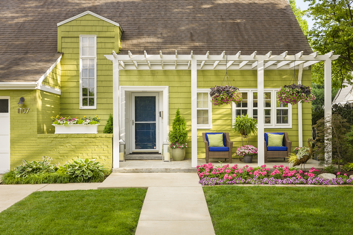
One way that structures are used in landscape design is to help define the space and anchor the garden among its surroundings. Walls, hedges, berms, arbors or pergolas and garden sheds are all solid structures that help to create a sense of place. They are used to segment out garden beds, define walkways, and give the eye a place to rest and take in the scene.
Structure also applies to individual plants, especially trees and shrubs. Pyramidal evergreens, Lollipop® crabapples, fastigiate deciduous shrubs and large, mature trees all contribute structure to garden designs based on landscape design principles.
Related: 21 Structured Plants That Make a Statement
When you are planning a new garden or renovating an existing one, structure is one of the first garden design elements to add to your plan. It provides the “bones” of your landscape, helps to define the space in which your garden will grow, where your focal points will be placed, and how visitors will experience your garden.
REPETITION

In garden design, repetition means using the same or similar elements throughout the landscape, reinforcing cohesive garden design ideas. Those elements could be organic masses of colorful flowers, tightly clipped hedges, or the same flower shape repeated. They could also be inorganic elements such as paving materials, flower pots in similar colors or shapes, or arched trellises.
When elements are repeated at precise intervals, it lends a formal, contrived look to the space. When it’s done subtly, the effect is more casual. With either method, repetition helps to make a space feel more cohesive and organized.
If you like to collect plants—one of everything will do—repeating a single variety or a set of one to three colors sporadically throughout the border will help tie the collection together. For instance, if you interplant globe alliums here and there down the length of a flower bed, they will naturally lead the eye from one end of the bed to the other so the viewer takes in the entire space together. Adding a short boxwood hedge along the front of a perennial bed will have the same effect but in a more formal manner. The more tightly you space the repeated items, the faster the rhythm it creates.
When repeating elements, remember that things often look best in odd numbers—one or three colors repeated instead of two, for instance—another key garden design element guideline. Or you could repeat five pyramidal shapes across the back of your border. The exception is when you are using a pair of flower pots or shrubs flanking an entryway to your home or garden to create symmetry.
BALANCE

Balance is something every one of us innately senses—in our lives as well as our gardens. We know immediately when something is off balance. In garden design, there are several ways to make a garden feel balanced, but they generally fall into two categories: symmetrical and asymmetrical, both guided by landscape design principles.
Symmetrical designs use repeated organic or inorganic elements of the same type and color on both sides of the composition, flanking an entryway, or running the length of a garden bed to create a balanced look. The trouble is that live plants are rarely precise by nature. Quite a bit of maintenance can be needed to keep them perfectly symmetrical.
Asymmetrical designs are balanced too, but in a different way. They take into account the visual weight of the elements—not just their physical size and number. Color, density and mass all play a roll in visual weight. A bright, dense, blocky element holds far more visual weight than a lighter colored, airy element even if both are exactly the same size. It takes several lightweight objects to balance out one heavyweight object. Consider the visual weight that objects hold when striving to create balance in asymmetrical designs.
Regardless of whether you employ symmetrical or asymmetrical methods in your design, visual balance is achieved when the elements on each side of the design are perceived as being equal in mass, strengthening long-term garden design ideas. Each side draws your eye equally until it settles on your focal point. Balanced garden designs create comfortable, welcoming places to relax and enjoy the outdoors.
Garden design is something that takes time and experience to master. Take chances with your plantings and if it doesn’t feel quite right, try again. There is no one right answer when designing your own garden. Hire the big jobs out, if possible, and save your back for fine tuning the design elements. Over time, you will achieve the garden of your dreams!
Learn more about garden design:
Read more about landscape design principles for residential gardens.
See how one man transformed his small garden in seven steps.
- Explore landscape recipe ideas.


